 Have you ever been in a flea market or second hand store and come across old photographs with no names, date or location on the back? Do you wonder who these people are, or how these photos ended up as orphans? A great grandparent perhaps, a school teacher, the local post master? Is it possible these photos will ever get reunited with their descendents and find their way back into the family album?
Having come across some recently, I decide to buy a few of these old anonymous photos and have now made a book of them. The book will be available at the Navan Fine Arts Show June 6 & 7 http://www.navanarts.com I am hoping that you will add your input to the book about what the lives of these people may have been like. Please come by, pick a photo or more, put pen to paper and help them to discover a life for themselves, for example: - what might their hobbies or favourite activities have been - what do you think they did for a living - where did they live - where were they originally from - did they have children - what did the future hold in store for them I am very much looking forward to reading all the comments and ideas - and seeing what the lives of these people may have been like.
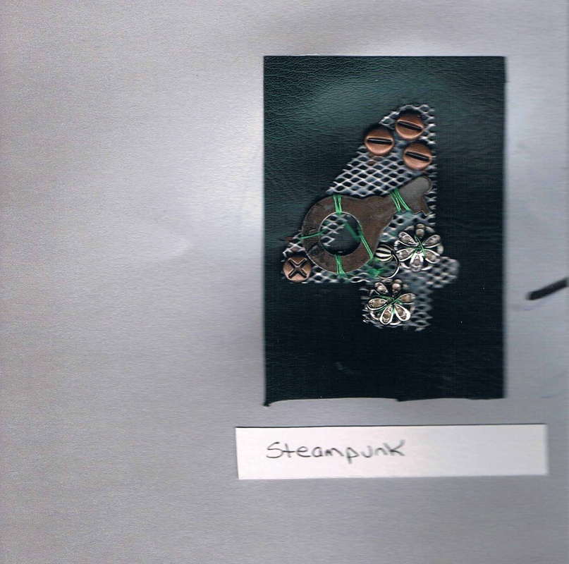
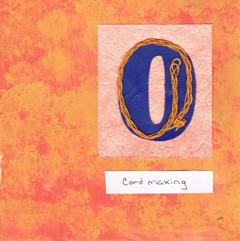
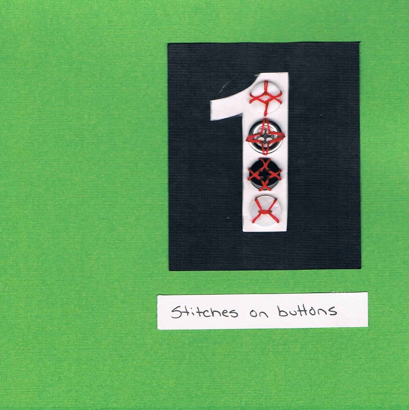
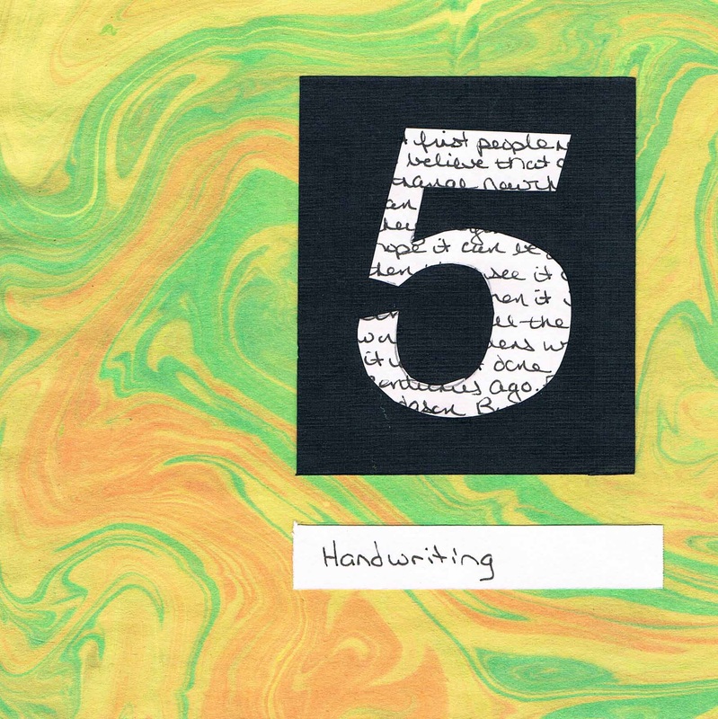
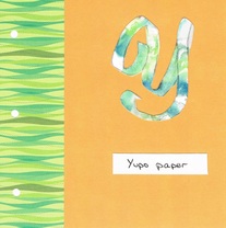
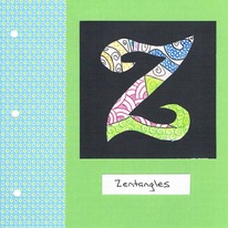
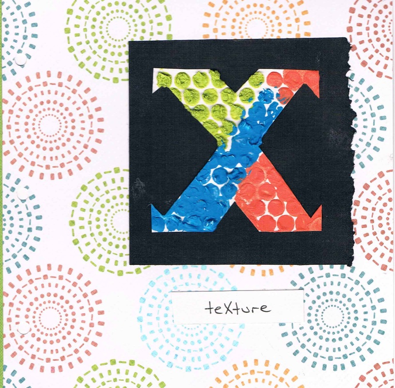
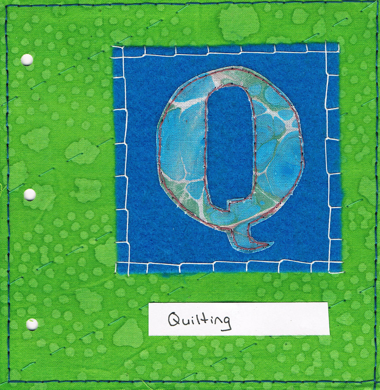
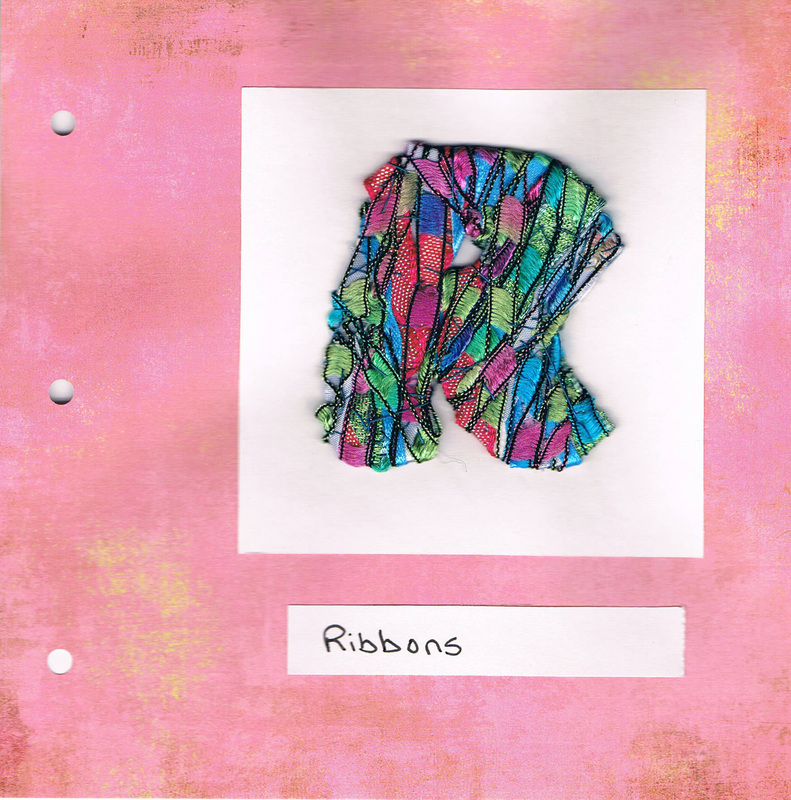
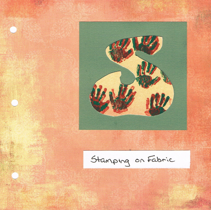
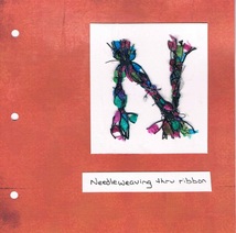
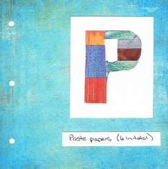
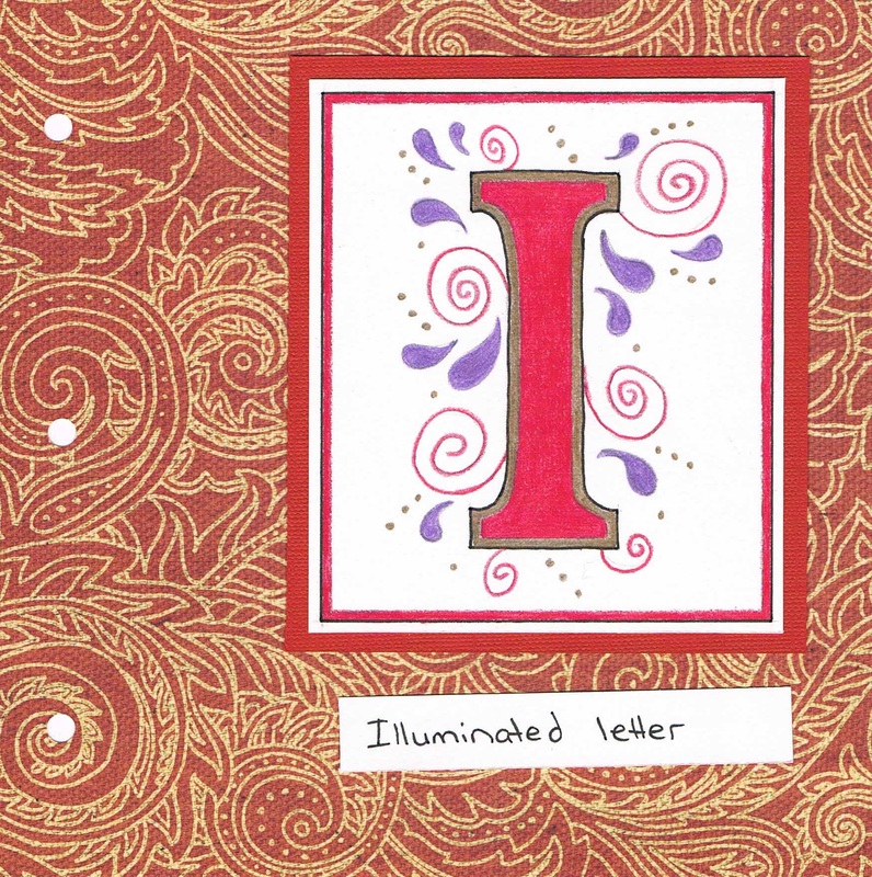
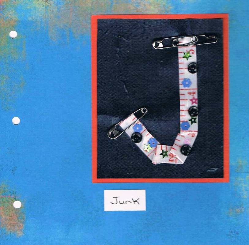
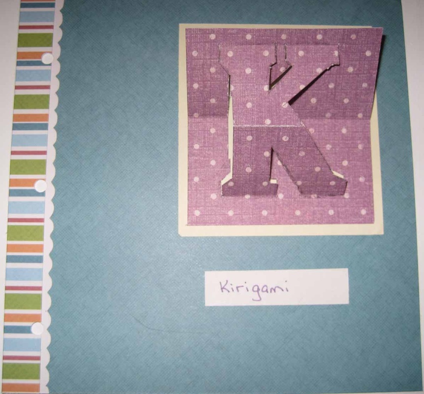
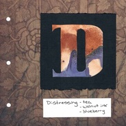
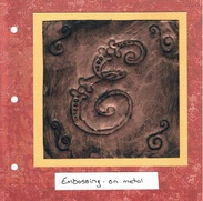
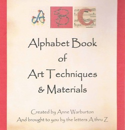 Following its completion back in March, the Alphabet Book has travelled to a few different venues and is next scheduled to be shown at the Navan Fine Arts Show & Sale June 6-7 at the Navan Curling Club. Other upcoming venues are listed on the events page. An addition is planned for the book - although only parts will be ready for the Navan show. I hope to have some of the new pieces available for viewing even if they are not yet inserted into its pages. And what are those pieces? The numbers 0 thru 9. By adding numbers, I will have more flexibility to make additional items such as birthday cards. Each letter - and eventually each number - has been scanned so that cards and other pieces can be made. Numbers 1 & 5 are done (see pictures below - click on the image for a larger picture). - 1 is various types of stitches used to sew on buttons - 5 is handwriting And while this list is not final, here are some thoughts on the other techniques and/or materials that may be used for make these new additions (and in no particular order and with one extra in the list). I'll be trying to post the completed ones on Sundays. - water soluble paper - altered book pages - steampunk - needle felting - lutrador - smocking (non-traditional) - cord making - embroidery on book cloth
Hope to see you at the Navan show!
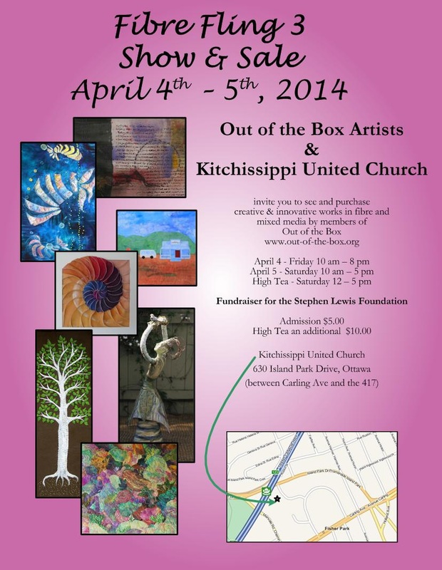
Some of these will be shown at the upcoming Fibre Fling Show April 4-5 of the Out of the Box Artists. Others won't (they are hanging in my house). All of these have been created - and stitched on - as a result of the course I've been taking at the Ottawa School of Art. Only 3 weeks left. Hover over the picture for more info.
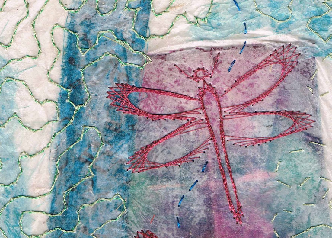
We have been working in our class with Tibetan papers (fibrous but somewhat translucent papers) and rice papers. After creating a collage using handmade papers, fabric, photos and other interesting pieces, we had the choice of using a gel medium or encaustics (beeswax) to attach all the pieces together. Most of us put an extra piece of Tibetan paper on top, forming a sandwich. I guess I didn't add enough gel medium, and the great papers and fabrics I had in the sandwich didn't show well once the medium had dried. The colours are definitely there, but only some of the detail can be seen and only in some spots. Decision time. Do I start over and try another piece, or do I see if I can make something out of this piece. Not wanting to start over, I decided to persevere. After all, sometimes our artistic accidents turn out to be a good thing. And it's only through continuing with the piece that we know if we'll end up with something that will turn out even better than the original plan.  Although this piece is about only half finished (again I took on way too much and have oodles of homework), I'm getting a textured look by adding a design common in the 18th century (the meandering thread line in green) plus the dragonfly as a focal point. The focus is now on the embroidery instead of on the papers and fabric sandwiched in the middle, and which are now a colourful background. The picture here is just a small portion of the piece - about 1/6 of the whole thing.
The Ottawa School of Art is giving us gallery space from March25 to April 8 at the Shenkman Arts Centre - I'm thinking this piece, if finished, will be on display. If not this one, then I better get cracking to start something else! Wow, this has been a fun undertaking. About half way through I was already mourning finishing this project, and wondering what I would do next. The last 2 letters are at the end of this post. But first, I wanted to mention some observations about this project that I've made over the past two months:
Now, on to the last two letters. And be sure to come by the Fibre Fling show April 4-5 and see the completed ABC Alphabet Book, as well as other projects I've been working on. The show looks like it will be amazing.
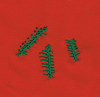
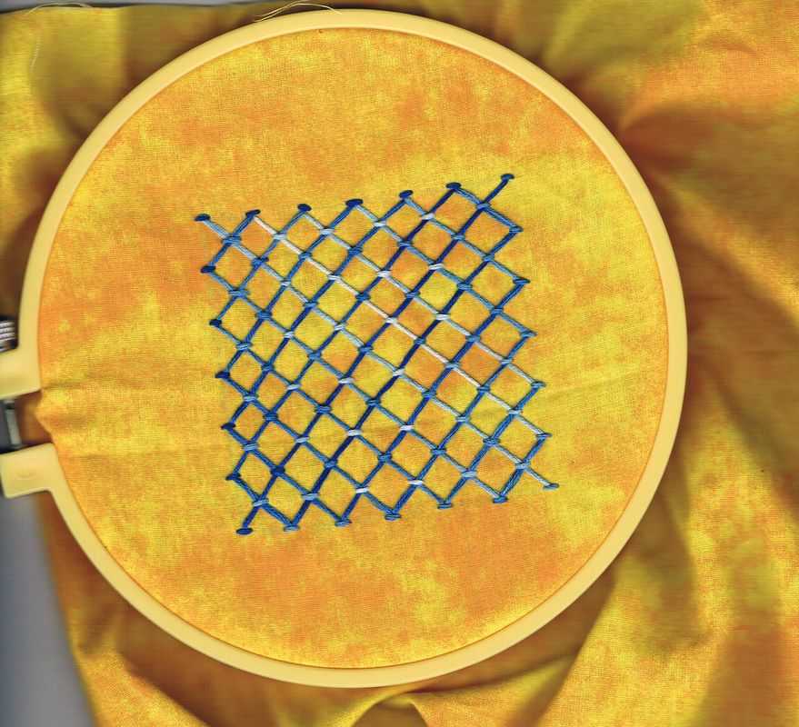
 Our task this week and last was to learn 6-7 new stitches and create a drawing out of them.
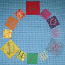
I chose to make a colour wheel. I had been wanting to make one anyway to use as a teaching tool, but didn't really want the traditional painted wheel or to buy one at an art store. So I decided to make one using coloured backgrounds and various stitch types. The thread colours I chose to use on each colour in the wheel has a specific purpose; e.g. to show complementary colours or secondary colours or analogous and so on. Rather than 6-7 stitches, I used 12 different stitches (it will actually end up being 14 as I also plan to add neutrals of black and white, which means I have a bit of homework to do to complete the whole project). The coloured bits shown here are not stitched onto the background. I added felt to the back of each piece, then covered a lightweight board with flannel. The felt stays on the flannel and I can move them around and use only a few or however many I need at a time to teach the colour wheel.
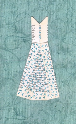
  Class was cancelled this week as the instructor was ill. I did manage to get my homework done however - with varying embroidery stitches & thicknesses, and some white beads added around the neckline on the dress. This piece was a bit hard to scan as I used a lot of white thread, on a whitish background, but I think the outline shows up adequately here and also some of the shadow lines. Will I use handmade Tibetan paper again? You bet. It looks delicate but is in fact quite strong, and I found I enjoyed working with it. 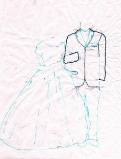 Perhaps I have been overly ambitious.
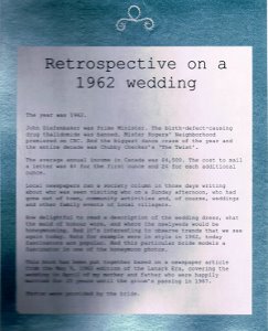
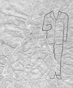
We started our first project in class yesterday doing a contour drawing of an item of our choice, then learning techniques to embroider the drawing on paper. We are using Tibetan paper which is very thin and translucent but quite strong and fibrous. It wrinkles easily but can be ironed later. Clearly this is a work in progress. The bits in light blue are my working drawing. These lines will get washed out once the project is complete. The dark lines are what I have completed so far in thread. Out of interest, the dress and suit are from my parent's wedding photo, taken almost 52 years ago. I have no idea how long this will take to complete. It's now homework as we move to another project next week, but I am not alone as everyone in the class was quite ambitious. We did promise to bring in this project once it's done and I will continue to post updates as I work on this piece.
I watched her use her fingers to feel the texture and pattern of the thread stitches. I was showing her the book I had made containing photos which I had enhanced with handstitching. Lily, one of the seniors I teach at a retirement home, has a visual impairment that affects her ability to see detail. She could see the photos had thread on them, but could not see well enough to view the individual stitches. So she let her fingers do her seeing.
I had previously framed each of these photos, but had decided to move them all to one of my handmade books. It was Lily who had inspired me to do this after showing me a book she had made several years ago that contained photos of her paintings, along with a full record of medium, where the scene was from, when sold, etc. I liked the idea of having all my stitched photos together in one place, creating an art book. I wanted to show Lily the book and let her know that it was she who had inspired me to put this together. Lily has been an artist all her life, exhibiting and selling many paintings, and I have come to admire her very much. We often share our excitement over new pieces, a new technique, or sometimes an older piece. And because of her visual impairment - and vision issues of some of the other ladies at the retirement home - I have tried to adapt the art classes I give so they can all still fully participate. Watching Lily smile as she felt the photos got me thinking that there is so much art out there that can only be enjoyed by seeing. And most pieces do need to be protected from dirt, light, dust and fingerprints. But why not create one or two textured pieces that can be part of an interactive, touch exhibit, appealing to more than just the sense of sight. Something to think about. 2 cups water - bring to a boil
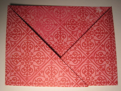
3 heaping tbsp. flour - put in a pot & slowly whisk the boiling water into the flour Boil until translucent, whisking continuously to avoid lumps. Will take approx. 3 minutes to cook. Allow to cool completely. Will store for up to 1 week in the fridge. Put a few tbsp. of the water/flour mixture into paper or plastic cups (ones that won't be used afterwards for food), mix in a bit of acrylic paint, then paint your paper. Add a second colour on top, either while the first colour is still wet or after drying. Try various tools to add texture and "scrape" the 2nd colour off the paper. Ideas for tools: old credit card, old fork, stylus, sponges, stamps, etc. Choose papers that are strong when wet. They may curl as they dry; once dry put heavy books on top for 24 hours to flatten. I have not yet tried this with gluten-free flour, but will try this when I am next making the paste. Will report back. 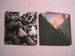 The first time I saw these folded square pocket envelopes, I wanted to learn how to make them. My envelopes shown at left are just 3 inches square, and are quite simple to make. And they can actually hold quite a bit; the one on the right has at least 5 sheets of cardstock in it. What I was really looking to make, however, was a rectangular, not square, pocket, part of our planned design for my stepdaughter's wedding invitations. Not being able to find any instructions online or in books for rectangular pockets, I decided it was time to create a design for one. I quickly discovered it was not as easy as making the square. But where there's a will there's a way, and I had the will, so I found the way. Although I did take a bit of trial and error. And this pocket envelope is easy to make. The difference is that there are more steps to make the rectangle than the square. And probably best to practice making one or two first. But overall I am very pleased with the result.
 Some of my students made these recently - they really enjoyed using the watercolour pencils on fabric.
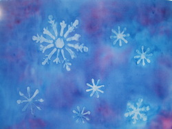
This art piece looks great in a window. The resist areas really show up well. Polyester fabric seems to work best – use white unless a different background colour is desired. Cut fabric to the size you want. I recommend using Fray Check or other product around the edges of the fabric to prevent stray threads; let dry; or make small seams with a serger. Tape down fabric onto wax paper, shiny side up. Choose a variety of snowflake stencils and sizes. Please first snowflake stencil on fabric. Using Elmer’s Washable School No Run Gel glue, spread glue with tip or with sponge brush or cosmetic sponge. Lift carefully from fabric, and place next stencil then repeat. The glue will act as a resist. Wash stencils when done and before glue dries. Wash sponges. Let fabric dry at least 12 hours. Mix 1 part fabric medium to 2 parts water in small jar. Brush fabric medium on fabric to wet it – works small parts at a time. I used watercolour pencils for this painting. Choose a background olour and a second colour to add some contrast. Begin to lay down the background colour one section at a time, adding a bit of the second colour for contrast or highlight. The pencils do not need to be sharp, but should not be too dull either. It works best to dip the tip of the pencil into the fabric medium/water mixture. Begin to mix colours together before the fabric dries. If it dries add more water. Use a wet cosmetic sponge and gently make circles to blend the colours together and to remove any blotches of colour that you do not want. Do not press too hard. If they colours do not blend well, leave for a few minutes then go back to it again. This will give the water time to “melt” the pencil. Once done, let your drawing dry. Remove painters tape. Hang in a window to let the light shine through the snowflakes. 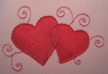 Supplies · Thread (2 colours) - I prefer Gütermann brand thread, but any good quality thread will do. Metallic is an option too. · Sewing needles – small enough so you don’t leave large holes in your paper · Needle or punch – should be either the same size or slightly larger than your sewing needle · Punch mat - the back of a mouse pad works very wel · Scotch tape · 2-sided tape or glue stick - I prefer the 2-sided tape or glue stick. Liquid glue works fine on cardstock, but may cause wrinkles on thinner papers · Scissors, for cutting thread · Cardstock (2 colours: 1 colour to embroider on (I used white for this project), and a second colour to use as a mat (I used a metallic red paper) · Ruler and cutting knife or trimmer , for cutting the cardstock · Tracing paper and pen or pencil · Blank card and envelope, approx. 5 x 6-1/2” 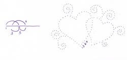 Technique PDF of pattern Open the design on your computer, re-size as needed, print out, then trace onto tracing paper. Be as accurate as possible when placing the dots. Cut your main piece of card stock to a size that the pattern will fit on nicely. Centre the traced design on the cardstock. Hold down securely and, using a needle or punching tool, carefully punch the design on your cardstock. Hold the card and tracing paper up to the light to ensure you have punched all the holes. When done, remove the tracing paper. Follow the numbers, starting at 1, on each part of the design. For the hearts, I recommend doing one half, then starting anew on the other half. Pull the needle through the cardstock from the back and tape down an end about ¼” to ½” in length. Try not to place the tape over any of the punch holes. Taping, rather than making knots, is done so that no bumps can be seen or felt through the paper. Continue to follow the numbers, as each section is completed, tape down the end of the thread and cut before moving on to the next section. Continue until each part of the design is complete. Finishing
To hide the back of the work, use your second piece of cardstock. Cut slightly larger than your embroidered piece, so it looks like a mat, and paste, or use the 2-sided tape to attach. When dry, paste onto a blank greeting card. Embellish with coloured pencil, jewels or other trim. © 2012 Note: This piece may be reproduced for personal use only, and may not be reproduced for sale. |
Artist - Anne Warburton


About MeIt's taken years to discover the medium I enjoy the most. And how what I have learned before somehow fits into what I am doing now. Even when I travel my needles and threads are with me so I can continue to create while away. Archives
June 2016
|